Today Andrea Hiltbrunner from the blog "DreAm heArt sMart ArT" has challenged people to post something creative on the theme of "Heart". Given how much fun I had participating in Jennifer McLean's "Shadows" challenge last week, I thought I'd participate in this challenge, too. (I'm thinking that participating in these creative challenges could be a bit addictive... but in a healthy way, that is!)
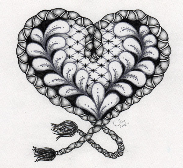
So here's my heart...
It's a "Zentangle inspired" piece of art -- inspired by the art form of Zentangle doodling but not holding to the rules of it.
Back in high school I doodled a lot in the margins of my notebooks. Then my inspiration game from faces -- I doodled eyes, noses, mouths, eye brows... (In retrospect, it probably looked pretty weird to have disconnected facial features surrounding my class notes... but I digress...)
I was intrigued when I first heard of Zentangle art some months ago not only because I used to love doodling so much but also because I'd been reading about the stress busting benefits of doodling. Doodling helps us relax... lowers blood pressure and heart rate... improves concentration and memory. (Quick... hand me a pen and some paper... I need to save as much of what's left of memory as possible...!!! lol...) One article I read pointed out that as children we intuitively did things that were stress busting -- like hugging and doodling.... things we really should do more of as we navigate this complex adult world.
So to me this heart art is about more than art in the shape we associate with the heart. The heart is often associated with creative inspiration, deep emotion, or our "true selves" and this art illustrates my journey to explore and reconnect with my creativity. But in creating this heart using a style of doodling -- a form of art that brings health benefits to our physical heart -- I am also more literally nurturing and caring for my physical heart and the figurative source of creativity.
Hmm... that's a bit of a mind bender... That something as enjoyable as art can also benefit us physically is one of those things that never ceases to amaze me. Somehow I grew up with the notion that anything that physically beneficial - like medicine - will be unpleasant. This (creating art) is the kind of medicine that's a pleasure to take!
So what kind of creative medicine are you "taking" today?? : )
Monday, November 5, 2012
Thursday, November 1, 2012
Shadows and Skies
Today I'm being brave and trying something just a little different.
I've been following the blog, "Just Add Water Silly" by fellow Vancouver Islander Jennifer McLean. She's a watercolour artist and hosts the "Artist's Play Room" where people share their interpretations of a weekly theme. I've been quietly observing (and enjoying) the submissions to the Artist's Play Room all the while thinking that maybe it would be fun some day to be brave enough to join in...
Well... today's that "some day" and I'm joining in. It's a little nerve racking to do something you've not done before and expose your art to a whole new audience... but (...pausing for a deep breath...) here goes.....
The theme this week is "Shadow" and below is my interpretation...
The artwork is based on some fall leaves I collected today...
When I began the art piece I rearranged the leaves and I positioned a desk lamp off to one side of the leaves to create more dramatic shadows -- the type of task lamp that creates a bright spot-light effect on things it is close to. In real life, the part of the shadows closest to the leaves include a bit of reflection from the yellowy orange of the leaves. I tried to suggest that in my shadows. I'm not entirely satisfied with how that turned out, but this is all about trying things and learning from our experiences... right? : )
The art piece was done with water soluble coloured pencils -- Inktense brand, to be exact. I'm working through Dion Dior's online workshop about watercolour pencils and I'm really pleased with how the Inktense brand are working for me. The leaves are outlined in a fine point Faber-Castell Pitt pen in Dark Sepia colour.
The next part of this post is in response to a blog post by Suzi - another alumni member of the Creative Courage class. Suzi writes the blog "Vignettes de la vie by Suzi Poland" and in her post of October 26th she posted a beautiful pastel night sky picture and posed the question, "Have you been to the desert and seen how big the sky is?" Now, Suzi's in Australia and I've never had opportunity to visit that country (yet...), so I can't say that I've seen how big the desert sky is that she's looking at. But I have been to Phoenix Arizona (USA) and I was blow away by what the desert sky is like there. Suzi's post inspired me to find some of the sky pictures I took in Phoenix last winter/spring and share a few with you. The sky here on Vancouver Island has (in my memory) never looked quite this amazing!!
Not much else happening creatively at the moment. I'm hoping to do more experimenting with the Inktense water soluble pencils. Perhaps Jennifer McLean's next Artist's Play Room challenge will fire up some more creative neurones in my brain... who knows where the creative whim will lead me!
So... what's inspiring you this week...??
: ) Fern
I've been following the blog, "Just Add Water Silly" by fellow Vancouver Islander Jennifer McLean. She's a watercolour artist and hosts the "Artist's Play Room" where people share their interpretations of a weekly theme. I've been quietly observing (and enjoying) the submissions to the Artist's Play Room all the while thinking that maybe it would be fun some day to be brave enough to join in...
Well... today's that "some day" and I'm joining in. It's a little nerve racking to do something you've not done before and expose your art to a whole new audience... but (...pausing for a deep breath...) here goes.....
The theme this week is "Shadow" and below is my interpretation...
The artwork is based on some fall leaves I collected today...
When I began the art piece I rearranged the leaves and I positioned a desk lamp off to one side of the leaves to create more dramatic shadows -- the type of task lamp that creates a bright spot-light effect on things it is close to. In real life, the part of the shadows closest to the leaves include a bit of reflection from the yellowy orange of the leaves. I tried to suggest that in my shadows. I'm not entirely satisfied with how that turned out, but this is all about trying things and learning from our experiences... right? : )
The art piece was done with water soluble coloured pencils -- Inktense brand, to be exact. I'm working through Dion Dior's online workshop about watercolour pencils and I'm really pleased with how the Inktense brand are working for me. The leaves are outlined in a fine point Faber-Castell Pitt pen in Dark Sepia colour.
The next part of this post is in response to a blog post by Suzi - another alumni member of the Creative Courage class. Suzi writes the blog "Vignettes de la vie by Suzi Poland" and in her post of October 26th she posted a beautiful pastel night sky picture and posed the question, "Have you been to the desert and seen how big the sky is?" Now, Suzi's in Australia and I've never had opportunity to visit that country (yet...), so I can't say that I've seen how big the desert sky is that she's looking at. But I have been to Phoenix Arizona (USA) and I was blow away by what the desert sky is like there. Suzi's post inspired me to find some of the sky pictures I took in Phoenix last winter/spring and share a few with you. The sky here on Vancouver Island has (in my memory) never looked quite this amazing!!
Not much else happening creatively at the moment. I'm hoping to do more experimenting with the Inktense water soluble pencils. Perhaps Jennifer McLean's next Artist's Play Room challenge will fire up some more creative neurones in my brain... who knows where the creative whim will lead me!
So... what's inspiring you this week...??
: ) Fern
Thursday, October 25, 2012
Playing With Watercolour Pencils
Hello again! Thank you all for your lovely, supportive comments on my last post about printmaking and my hand coloured prints. There were some really great questions and suggestions which I want to respond to in a moment. But first I want to share the fun I've been having with my Derwent Inktense watercolour pencils!
Like my busy, brightly coloured table cloth...? : ) My workspace is the dining room table, and this is my art making table cloth - paint spills won't show much on a busy patterned surface like this! And I love how cheery and colourful it is - it helps inspire me.
First I decided to just do something "fun" to test out the Inktense pencils...
I love how bright and intense they are when washed with water. My other "regular" watercolour pencils look so much more pale and washed out than these ones do.
That was so much fun I decided to try something else.....
In my minds eye the "Hearts can mend" piece was supposed to look much lighter and brighter, but somehow it ended up looking somber, dark and heavy. But at least it demonstrated that the Inktense pencils can create some lovely rich colours. : )
I surfed the internet to see how other artists are using watercolour pencils, and came across an online workshop by Dion Dior. Her preference is to use Inktense pencils. So I'm trying some of the exercises she suggests in her workshop. One exercise involved blending colours using the image of a cherry. Here's my version of her cherry illustration...
There are several layers of pencil 'washes' built up on this cherry to achieve the final image. Once I was satisfied with the colours and shading, I went around the outside of the cherry, stem and leaf with a 0.03 fine tipped black Micron pen. While I'm pleased with how it turned out, it made me want to try pencil-painting a "real" cherry. There are cherry trees in the backyard where I live, so I found a photo from the spring and started my own cherry picture.
I love the soft look of the underpainting of the cherry (fuchsia pink blended with deep yellow)...
When the green cherries on the backyard trees were beginning to ripen in the spring they went through a phase of being a soft yellowy pink similar to the colours in this underpainting. But today my intention was to pencil-paint a ripe cherry... so more layers of pencil were added and washed with water - layers of warm orange red, cool blue red, and a deep wine red.
And there you have it... a ripe cherry hanging from the branch!
I signed my artwork with every intention of it being a finished little piece... but the more I looked at it the more I felt like something was missing. So I decided maybe it needed a little background colour. Out came the sky blue pencil...
The colour wash is really pale (and hard to see in the photo above!) but I think it finishes the piece quite nicely. (Since you can't really see it, you'll just have to trust me on this... lol...)
One thing I like about using the watercolour pencils is that when you wash water over the pencil it doesn't completely dissolve the pencil marks. I deliberately used that feature when laying down the blue pencil in the background - I don't know if you can see in the photo below (particularly the lower left corner) that I stroked the pencil in a bit of an arc.
I tried to stroke the pencil in curves and swirls over the entire background and even after it was washed with water you can still see faint traces of the original blue pencil strokes. I think this adds some nice texture and motion to the background.
Oh, almost forgot to say... one nice feature of the Inktense pencils is that once you've washed them with water and the paper has dried, the ink is fixed to the paper. Subsequent washes of water will not lift or smear previous layers of pencil-paint. What a lovely feature of these pencils! Makes glazing layers of colour so much easier than with traditional watercolour paints. : )
So there you have it... the fun I've had playing with watercolour pencils!
Ok, now I'd like to respond to some of the comments from my last post on printmaking. Hollace asked, "I am curious about the over-printing. Is that necessary?" In this instance it was necessary because the inks we were using to print with were water based inks. Using water media over top of the inked lines created smeared ink. : ( Not a good look. There are waterproof inks available - oil based I believe - and if they were used a person could apply watercolour paint over them without any problem at all. But oil based inks require clean-up with chemical paint cleaning agents, etc, and the workshop instructor preferred to use the less toxic water-based inks. So how do you use water-based inks and still over paint them with watercolours? The instructor had come up with a method of printing her first image in a very pale colour of ink. For my prints I chose a pale grey so that if some of it smudged when I applied my watercolour paint it wouldn't be so noticeable. I did experience a little bit of smudging/smearing - applying your paints with a single, light stroke is definitely preferable.
Hollace also commented, "I think I would just try to 'color inside the lines' if the print were compromised by the wash." You know, I never thought about just using watercolour 'inside the lines' but that could work nicely, too. : ) "The blocks I've done were lino on a wood block. What you are using seems softer, like a rubber eraser. Did you like the product? The linocuts were hard and it was easy to lose control with force." Ah, yes... I remember the tough-to-cut lino from high school and yes, the vinyl material I used feels a lot like a rubber eraser! This product is MUCH easier to use. The instructor recommended a vinyl product called "Saf-t-kut". It was quite soft and very easy to carve without a lot of pressure which gave me good control over the cutting tools. Speedball makes a pink coloured material that seems similarly soft - it wasn't the instructor's preferred material so I haven't tried it yet and can't tell you much about it. If anyone out there has worked with the Speedball product I'd love to hear how it's worked for you.
Like my busy, brightly coloured table cloth...? : ) My workspace is the dining room table, and this is my art making table cloth - paint spills won't show much on a busy patterned surface like this! And I love how cheery and colourful it is - it helps inspire me.
First I decided to just do something "fun" to test out the Inktense pencils...
I love how bright and intense they are when washed with water. My other "regular" watercolour pencils look so much more pale and washed out than these ones do.
That was so much fun I decided to try something else.....
In my minds eye the "Hearts can mend" piece was supposed to look much lighter and brighter, but somehow it ended up looking somber, dark and heavy. But at least it demonstrated that the Inktense pencils can create some lovely rich colours. : )
I surfed the internet to see how other artists are using watercolour pencils, and came across an online workshop by Dion Dior. Her preference is to use Inktense pencils. So I'm trying some of the exercises she suggests in her workshop. One exercise involved blending colours using the image of a cherry. Here's my version of her cherry illustration...
There are several layers of pencil 'washes' built up on this cherry to achieve the final image. Once I was satisfied with the colours and shading, I went around the outside of the cherry, stem and leaf with a 0.03 fine tipped black Micron pen. While I'm pleased with how it turned out, it made me want to try pencil-painting a "real" cherry. There are cherry trees in the backyard where I live, so I found a photo from the spring and started my own cherry picture.
I love the soft look of the underpainting of the cherry (fuchsia pink blended with deep yellow)...
When the green cherries on the backyard trees were beginning to ripen in the spring they went through a phase of being a soft yellowy pink similar to the colours in this underpainting. But today my intention was to pencil-paint a ripe cherry... so more layers of pencil were added and washed with water - layers of warm orange red, cool blue red, and a deep wine red.
And there you have it... a ripe cherry hanging from the branch!
I signed my artwork with every intention of it being a finished little piece... but the more I looked at it the more I felt like something was missing. So I decided maybe it needed a little background colour. Out came the sky blue pencil...
The colour wash is really pale (and hard to see in the photo above!) but I think it finishes the piece quite nicely. (Since you can't really see it, you'll just have to trust me on this... lol...)
One thing I like about using the watercolour pencils is that when you wash water over the pencil it doesn't completely dissolve the pencil marks. I deliberately used that feature when laying down the blue pencil in the background - I don't know if you can see in the photo below (particularly the lower left corner) that I stroked the pencil in a bit of an arc.
I tried to stroke the pencil in curves and swirls over the entire background and even after it was washed with water you can still see faint traces of the original blue pencil strokes. I think this adds some nice texture and motion to the background.
Oh, almost forgot to say... one nice feature of the Inktense pencils is that once you've washed them with water and the paper has dried, the ink is fixed to the paper. Subsequent washes of water will not lift or smear previous layers of pencil-paint. What a lovely feature of these pencils! Makes glazing layers of colour so much easier than with traditional watercolour paints. : )
So there you have it... the fun I've had playing with watercolour pencils!
Ok, now I'd like to respond to some of the comments from my last post on printmaking. Hollace asked, "I am curious about the over-printing. Is that necessary?" In this instance it was necessary because the inks we were using to print with were water based inks. Using water media over top of the inked lines created smeared ink. : ( Not a good look. There are waterproof inks available - oil based I believe - and if they were used a person could apply watercolour paint over them without any problem at all. But oil based inks require clean-up with chemical paint cleaning agents, etc, and the workshop instructor preferred to use the less toxic water-based inks. So how do you use water-based inks and still over paint them with watercolours? The instructor had come up with a method of printing her first image in a very pale colour of ink. For my prints I chose a pale grey so that if some of it smudged when I applied my watercolour paint it wouldn't be so noticeable. I did experience a little bit of smudging/smearing - applying your paints with a single, light stroke is definitely preferable.
Hollace also commented, "I think I would just try to 'color inside the lines' if the print were compromised by the wash." You know, I never thought about just using watercolour 'inside the lines' but that could work nicely, too. : ) "The blocks I've done were lino on a wood block. What you are using seems softer, like a rubber eraser. Did you like the product? The linocuts were hard and it was easy to lose control with force." Ah, yes... I remember the tough-to-cut lino from high school and yes, the vinyl material I used feels a lot like a rubber eraser! This product is MUCH easier to use. The instructor recommended a vinyl product called "Saf-t-kut". It was quite soft and very easy to carve without a lot of pressure which gave me good control over the cutting tools. Speedball makes a pink coloured material that seems similarly soft - it wasn't the instructor's preferred material so I haven't tried it yet and can't tell you much about it. If anyone out there has worked with the Speedball product I'd love to hear how it's worked for you.
Suzi suggested, "I wonder what adding a little inktense pencil over them would look like." Great suggestion Suzi! I'd not thought about doing that but I think it would work well. The pencil stroke marks that show even after you've washed them with water would create more texture. That would have worked especially well in the foreground area of my print - the area that was to represent grass and vegetation. I'll have to play around with colouring prints with Inktense pencils. : )
As for the input on which print people liked best - it's a tie. Between comments on the blog and comments on Facebook, it would seem that the first (blue greens) and third (all blue) prints tied for most popular and the second (warm sunset colours) print was many peoples' second favourite. Thank you all for taking time to give me your input!
Not sure what project I'll be working on next. I might play around with mixing traditional watercolours with the Inktense watercolour pencils... but then again... I guess you'll have to check back next week to see where the creative muse led!
-- Fern : )
Thursday, October 18, 2012
More Fun With Print Making
Two posts ago I told you about experimenting with print making. At that time I had three prints that I was going to hand colour with watercolours and then over print in black ink. Well... they're done!... and I'm excited to show you how they turned out.
Peaceful green and blue-greens...
The warmth of the late day near sun-down...
Icy cool blues...
Three different versions - different moods. Which one do you like best...??
If the last one (the all blue one) looks a bit blurry, don't run out and get your vision checked. When I over printed it with black ink I didn't pay quite enough attention to making sure the plate was going to accurately line up with the grey lines previously printed. Oops...!! You can see the grey lines showing a little above the black lines in the picture below...
So, good lesson learned... check v-e-r-y carefully before overprinting to make sure you have everything lined up as closely to the original printing as you can!
Other than that little glitch, I think my experiment with hand colouring and over printing went quite well. I'd like to try more printing and learn some new carving techniques. So many thing to try... so little time! lol...
In an earlier post I wrote about the fun I was having with pearlescent paints. Unfortunately it does not show up so well in these pictures, but I used some pearlescent paints on the top of the mountain to try and create the idea of sun glistening off snow.
And I thought I'd share pictures with you of what the printing "plates" look like.
This is what the whole plate looked like before I cut the sky away. The black parts are the uncarved parts that pick up the paint when the inked brayer (roller) is rolled over the print, and those are the parts that press the ink onto the paper when you lay paper over the plate and press down on the paper.
And this is my plate now - cut in two, so I can print the sky separately or not print it at all if I want to leave a blank area to hand colour (like in the three prints I hand coloured). Notice that everything on the plate is reversed from the finished print? You have to account for the reversed image when you are planning how you want to carve your image. : )
Here is a view of the side of the "plate" - you'll see that in some placed I gouged a bit deeply into the rubbery material. Good thing it was thick! Practice would help me make more uniform cuts.
Other than that, I've been playing with my watercolour pencils again. I bought some Derwent "Inktense" pencils and I'm loving the beautiful rich colour I get when I wash coloured areas with water. Next post I'll show you what I've been working on... (don't you love 'cliff hangers'...?? lol...)
I hope you're making time for some creativity in your life - it's a great stress buster!
: ) Fern
Peaceful green and blue-greens...
The warmth of the late day near sun-down...
Icy cool blues...
Three different versions - different moods. Which one do you like best...??
If the last one (the all blue one) looks a bit blurry, don't run out and get your vision checked. When I over printed it with black ink I didn't pay quite enough attention to making sure the plate was going to accurately line up with the grey lines previously printed. Oops...!! You can see the grey lines showing a little above the black lines in the picture below...
So, good lesson learned... check v-e-r-y carefully before overprinting to make sure you have everything lined up as closely to the original printing as you can!
Other than that little glitch, I think my experiment with hand colouring and over printing went quite well. I'd like to try more printing and learn some new carving techniques. So many thing to try... so little time! lol...
In an earlier post I wrote about the fun I was having with pearlescent paints. Unfortunately it does not show up so well in these pictures, but I used some pearlescent paints on the top of the mountain to try and create the idea of sun glistening off snow.
And I thought I'd share pictures with you of what the printing "plates" look like.
This is what the whole plate looked like before I cut the sky away. The black parts are the uncarved parts that pick up the paint when the inked brayer (roller) is rolled over the print, and those are the parts that press the ink onto the paper when you lay paper over the plate and press down on the paper.
And this is my plate now - cut in two, so I can print the sky separately or not print it at all if I want to leave a blank area to hand colour (like in the three prints I hand coloured). Notice that everything on the plate is reversed from the finished print? You have to account for the reversed image when you are planning how you want to carve your image. : )
Here is a view of the side of the "plate" - you'll see that in some placed I gouged a bit deeply into the rubbery material. Good thing it was thick! Practice would help me make more uniform cuts.
Other than that, I've been playing with my watercolour pencils again. I bought some Derwent "Inktense" pencils and I'm loving the beautiful rich colour I get when I wash coloured areas with water. Next post I'll show you what I've been working on... (don't you love 'cliff hangers'...?? lol...)
I hope you're making time for some creativity in your life - it's a great stress buster!
: ) Fern
Saturday, September 29, 2012
Art Collaboration With Richard Wong, Watercolour Painter
The summer is a creatively inspiring time for me. Yes, the warm sunny days seem to fire up my creative neurons. But summer is inspiring for another reason - it's a popular time for art shows! Doesn’t viewing other artists' work get your creative juices flowing, too? Perhaps someone else's use of colour will inspire you... maybe it will be the use of an usual painting material, perhaps a new type of paper for water media... or a technique that is freshly interpreted.
At this summer's art shows I met many artists and found them to be of generous spirit and genuinely interested in helping their fellow artists. For example, I met Richard Wong - a local oriental brush and watercolor artist who has developed an unique style of painting on a special type of paper. During October Richard will be having his first solo art show "Songbirds of Victoria" at Island Blue Art Store here in Victoria, as well as showing some of his work at The Gallery in Oak Bay Village. Here's a look at some of his work --
![]() |
| "Finches & Sunflower" by Richard Wong; watercolour on masa paper |
![]() |
| "House Finch" by Richard Wong; watercolour on masa paper |
Richard and I discussed our mutual belief that there's a great benefit in artists working together - collaborating on projects and assisting each other toward mutual goals. I was honoured when Richard asked if he could use some of my bird photos as inspiration/source material for some of his "Songbirds of Victoria" paintings. Here are three paintings inspired by my photos:
![]() |
| "Chickadees 2" by Richard Wong; watercolour on masa paper |
![]() |
| "Robin & Blueberries" by Richard Wong; watercolour on masa paper |
![]() |
| "Thirsty Sparrow" by Richard Wong; watercolour on masa paper |
Richard has many more paintings posted to his website (http://www.richardwongwatercolors.ca/). Which is your favourite...? Personally, the "Thirsty Sparrow" is my favourite... but perhaps when I see his next group of paintings I may decide I have a new favourite! : )
I hope you've enjoyed being introduced to Richard's work. I know I'm looking forward to seeing what he creates next, and to collaborating on future projects.
What's inspiring you creatively lately...??
: ) Fern
Friday, September 21, 2012
Experimenting With Print Making
When's the last time you tried print making? For me, it was high school and back then we called it lino printing. I was pleased to learn that old fashioned lino printing has become much easier and more enjoyable thanks to new and improved materials.
Recently a friend suggested taking a workshop in printmaking from Jennifer McIntyre. I'd not really thought about doing printmaking before my friend expressed an interest in the workshop, but when opportunity comes knocking I've learned that it's a good idea to hop on board. (Oops... mixing metaphors there... but you get the drift, right??) We showed up at class clutching a selection of B&W images (photos converted to B&W and printed on everyday letter sized paper), cutting tools and pieces of thick, soft, easy to cut vinyl.
I chose to base my piece on a photo of Mount Baker, taken from Cattle Point just outside of Victoria, BC.
It took me much longer than my friends to get my image carved and ready for printing. I probably should have tried something a bit less detailed for my first attempt at printmaking after all these years... but I see a pattern developing in my life... I tend to jump in at the deep end of the pool when I learn new things by starting out with a challenging project instead of wading in gradually with something quick and easy. (Note to self... you have permission to not do things the hard way! Lol...)
Part way through the carving process, Jennifer (our instructor) suggested that we could print an "artist's proof" to get a sense of how our image was developing. The first picture on this post is one of my artist's proofs. Jennifer showed me how to ink the vinyl "plate" with a "rainbow roll" - multiple colours of ink on the brayer that created a gradation of colour on the printed image. I am completely in love with that artist's proof with it's rainbow roll! Oh, and the light purplish line you see in the foreground of the print...? That's colour that transferred from the black Sharpie marker I'd used to draw my carving lines on to the vinyl. It wasn't intended to be part of the print, but I happen to really like how it looks. Hmm... maybe I'll have to try other prints with deliberate Sharpie marker line transfers in them! : )
Back to carving away more of the vinyl... and soon I was ready to make a print of the finished plate -- this time all in black.
So, what do you think? The black and white image is very dramatic. Very different from the softness of the artist's proof at the top of this blog.
Jennifer suggested that the sky could be inked a different colour. To do that I ran a utility knife between the land and the sky and completely cut off the sky portion of the plate. (It felt a little strange to cut apart the thing you'd just spent hours to create!!!) When we printed it, the bottom of the plate was inked with a dark colour (that came out looking black) and the sky portion of the plate was inked with another rainbow roll. The two pieces of vinyl were nested snuggly beside each other like puzzle pieces before the paper was laid down. Here's the result...
I really like that effect, too. Oh... the possibilities...!!! : )
At the end of the workshop Jennifer had me print a handful of copies in light grey of just the bottom of the plate (without the sky). These prints are for me to hand colour with watercolour paints. Once they're painted and dried, I will over print them with black ink. That should be interesting... we'll see how it turns out. I'll keep you posted!
As always, I hope you're taking/making time for some art in your life. It really can be an uplifting break from the stresses of everyday life!
: ) Fern
Sunday, August 5, 2012
Magpies Know a Good Thing When They See It!
Can you believe it's August already!!?? Personally, I am loving all the sun we're having the past few weeks. I do feel so much better in warm sunny weather.
As I wrote this post I realized that the art I've been engaged in lately is all about pretty shiny things - like shimmer paint and glass - and it's not hard at all to understand why Magpies (and other birds and animals for that matter) find pretty shiny things so attractive.
The image above is a page from my sketchbook. I decided to play around with watercolour pencils, gold acrylic ink (outlining the pears in the upper right corner) and "Pearlex" paints (a pan of pearlescent watercolour paints). What fun!! You can see the pearly sheen in the highlights of the pears in the upper right corner. Now I want to accent everything in Pearlex paints...! lol...
Over the past few months I've finished the line of custom bridal stationery and a beautiful colour catalog showcasing it (thanks to the help of Scott at Art Ink Print!). Yeah!! A new bridal shop in Green Bay, Wisconsin (USA) called AlfA Bridal is now carrying my custom bridal stationery line. It's all so very exciting. : ) My west coast sales rep has three Canadian retailers to show the catalog to and we'll see if any of them are interested in the line. I also noticed two new bridal shops have opened recently here in Victoria and I'm thinking of approaching one or both of them with the line as well.
As for the "everyday" line (as I refer to the non-bridal stationery card line), some new shops have picked it up including "Buchan's" in Vancouver, BC. Last week the newly opened gift shop "B&K Jewelry and Gifts" located in the town I grew up in (Sooke, BC) agreed to carry my cards. (Can you see me waving happy hands in the air...!!??) A greeting card display rack has been ordered and I hope it comes soon so I can get the cards on display. Little by little the business is starting to grow... and its teaching me patience... you know... that thing I was told as a child I didn't have enough of... : ) If nothing else this business of starting a business will perhaps teach me a lesson about patience! lol...
Somewhere in between working on the bridal card line and doodling in my sketchbook, I also played around with glass. Glass has always fascinated me - besides being colourful, it's so smooth and shiny. But I was firmly convinced glass art was difficult and some of the techniques might even be a bit dangerous. That was then... Now I know just how much fun working with glass (and fire) can actually be! I signed up for a 2-evening "Art Glass Sampler" workshop. Some glass art techniques were simply discussed and samples were passed around. But for other techniques we got to participate in creating our own samples. That was the fun part! The "hands on" techniques included sandblasting, tack fusing, full fusing, embossing and bead making. Here are a few of the samples I created.
![]() |
| L to R: full fused glass coaster, sand blasted mirrored glass, beads (see them reflected in the mirrored glass?) and tack fused glass coaster |
Bead making involved fire - an oxyacetylene torch to be precise. The instructor told us that some people love working with glass and fire... others not so much. Apparently I have a little pyromaniac somewhere deep down inside because I really enjoyed working with glass and fire. I can't wait to go back and play around with more glass. My biggest problem is deciding which type of glass art to do more of -- fusing or beadmaking...? hmm...
What else is on my creative "wanna-do" list? I am already starting to think about developing the newest cards to be added to the "everyday" greeting card line. I'd like them to be ready to debut in January 2013 so I need to start soon choosing the sentiments and images I like the best. I think I'll probably aim to add 12 new cards to the line... we'll see. And my watercolour paints are calling to me and teasing me with ideas of how I could combine them with more beautifully shimmery Pearlex paint... : ) Oh, and of course I'll be busy taking more photos -- that's kind of a "given" as I seldom leave home without my trusty old camera.
I hope you're enjoying your summer... unless you're reading this from the southern hemisphere, and then I hope your winter is going ok. Either way, I hope you are finding time for some form of art.
: ) Fern
Subscribe to:
Posts (Atom)


